Friday, 29 November 2013

Front page development

Positioning of the photograph

Originally I planned on having one main image that would cover the whole front page, but stretching this image would ruin the pixels and distort the image which would lead to an unprofessional look, however I have adapted too this problem and decided I will have another story beneath the main image.


Inclusion of key conventions and features

Issue number, date, website and price have all been added in the same colour and font for recognisability. The positioning of the conventions are all very typical too any other magazine however the font is bigger than what you would expect because I want to take up as much space as possible due to the problem of not being able to stretch the image too fill the page.

Anchorage text

 'The background to my new album is creepier' this play on words intrigues the audience and makes them wonder 'what could be creepier than the creep?'
It is positioned between the name of the artist at a slant too add a tone of informality and too ease the mind of the audience as it is quite a scary look. The colour pink also carry's through the house style of my flamingo too further give it recognition.


Prop/setting explanation

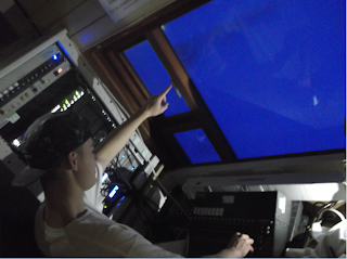
Dj mixers - Too highlight that THE CREEP is infact a Dj and that he is a skilled artist, the mixers authenticate the photo too the audience as it looks like he is in a club loving the music. It will also inspire my target audience too buy this magazine as the mixers look complicated which heightens the attraction of THE CREEP as he is creating (live) the music that my audience adore.
The window screen - The setting was a room above the auditorium which enhanced my club-like vibe to it as most djs are positioned above there audience too enhance there status as the people in control,
 Instead of lowering the authentic look by having a view of the auditorium I put up a blank screen in front of the window so I could display a vibrant colour onto it to make it seem like THE CREEP was looking down onto the club goers who are in a foggy mist of partying.

Thursday, 28 November 2013

The setting/scene of the photographs

Everything within the shot are my own props, i wanted to make the scene of a dj set  

Photographs for my magazine


Photographs for my magazine


Main image photographs

Considering garage music artists are usually dj's or on the decks, I wanted my main image to be a solo garage artist in the environment of a club, I wanted to portray my artist as a mysterious character that would intrigue the reader. I wanted a picture to compliment and mould into my dark and light colour scheme for an easier effect on the eye which would make my magazine look professional. So I used a male model aged 17 Callum Ruane who is a fan of garage music but most importantly represents my audience in terms of style. I got Callum to dress in street wear ,the props used were a 5-panel hat and a white plain oversized t-shirt with a street wear brand on the front. No make up was used on Callums face as he is male but I used lighting effects with an iphone torch held on one side of the face too create a shadow effect on the close up of his face too emphasis that there is two sides too the artist and the album. I shot my photos in an old school music studio that had a window facing out into the hall ,so I pulled a projector screen in front of the window as the hall would disrupt my mise enscene, I used disc mixers for extra authenticity and headphones too make it look like a live club session. The green eye of callum will compliment the green colour of my anchorage text, giving a further creepier and authentic look. My anchorage text will be the name of the artist ;


My magazines house colours are black and white so the light and dark effect of the lighting and the white top on the dark background will melt into the front page excellently.
the background of this photo could of been improved as the light could of been a different colour as I had the prop of red and blue transparent paper that would of given an extra edge, but after consideration I think the main focus is on my artists face so I don't want anything to take the attention away from that and also using a different coloured background light would of disrupted the colour scheme of dark and light contrasts.
The direct address of the eye contact makes the reader feel uneasy as the artist is not portraying a relaxed, comforting look, he looks like he means business.
As 'The creep' has a reputation for being creepy this image doesn't harm that representation as it is a very scary image that will almost certainly capture the audiences attention.
However as I was cropping this image onto the front page of my magazine I noticed that I could increase the contrast of the image by 10% too completely allow the smooth transition between image and background of the magazine;
Although even though it looks smooth on the eye, in my opinion it looks too artificial and takes away the 'in the moment' edge with the editing, garage music is all about the raw emotion and by editing this already perfect image it takes away the authenticness of the artist.


Magazine base


My iconic masthead will take up the whole width of the magazine to emphasis the originality, the black background allows the masthead to stand out more and make more of a statement. The black is neither a male or female but represents a more adult tone to the magazine.


This magazine has a similar base ,the black gives it an urban edge which contrasts with the other magazines on the shelf ,even though black isn't exactly eye catching it is certainly going to stand out amongst the bright pinks and greens. Also a black base allows layers to stand out and seem more important.


Tuesday, 26 November 2013

Final masthead


Final masthead


Audience feedback

What music do you associate with the word jungle ?

- House music, dubstep, garage, remixed music
-fast music with alot of different musical elements

What do you think of in terms of sound when you think of jungle?

- Fast beats
- dancing
-bass
-DJ's

This research evidence comfirms to me that my target audience will associate jungle with garage music and the style o0f music that surrounds the genre.

Saturday, 23 November 2013

Primary qualitive audience research

I have chosen 'Jungle' as my masthead and brand for my garage music magazine as I think it represents garage music in terms of its urban, vintage background as films like 'jumanji' 'George in the jungle' 'jungle book' etc. are all vintage films, so the audience will associate jungle with a vintage sound such as garage which has been around a long time. It also represents the music itself as the jungle is full of different elements and so is garage music. However in the 80's was the rise of 'old school jungle' music and faded out not long after, a form of garage music in its own right a sub genre of it, this could mislead my audience if they have knowledge of jungle music and interpret that my magazine is purely a niche magazine about jungle music, but my TARGET AUDIENCE will not associate 'jungle' with jungle music as they will have been born in a later generation, however I will conduct some research of what my target audience imagines when they see my masthead.

My research method

I have designed two simple questions that I will hand out too people that fit my reader profile;

Reader profile

A reader profile is a portrayal of readership demographics prepared by magazines. It essentially is the perfect audience who your magazine is aimed at, so the right advertisements can buy a place in your magazine, therefore you can charge more if your magazine fits the advertisers profile as you know that your magazine is the only one that is suitable for that company.

My reader profile

As there is no current garage magazine on the market I cant draw out and compare there audience profiles so I have realised that garage music is played at hot nightclubs and car parks, the age for these clubs such as 'rainbow' in Birmingham is 18-24, however house party's play mostly garage music so my lowest age range would be 15 not 18, radio1 xtra's highest age range is 30, however I don't see a 30 year old buying a magazine that 15 year olds are buying, so for that reason I am making my highest age range 23.
 
 
The gender of my reader profile is not something I can depict because females and males both listen too radio1 xtra and go too the same raves and partys and dance too the same music, most of my urban style girl-friends listen too garage all the time so no gender has the majority too design my magazine towards.
 

The style

My stereotypical consumer will have an urban, individual style, dressed in expensive street wear. There dialect will be street slang as my readers will be cultured to the urban way of life, some people might even go as far as stating garage music is a way of life too my target audience, its a way of expressing themselves through dance and beats whilst connecting too the featured vocalists that are on many tracks.


Social status

My reader profile will slot into social class E because they will be either a student or in low paid work as they live the urban life.


The style of my audience is based on the artists themselves, music is my audiences lives, it influences everything, so my magazine has to represent not just the music but every aspect of life.


There the ones who are the first to recommend a new tune or fashion trend within their peer group.


My demographic spans across from the young bedroom dj to accomplished producers, there the best informed group about upcoming tunes and the new clubs to be at.


Friday, 22 November 2013

Mock up Production planning and ideas

 
The basic layout for my magazine will have a main image and a couple of main story's in anchorage boxes that I made on paint using the spray can effect for an extra urban edge. My main image will be of a solo artist called artificial ,the font I have used is very grunge but the font is iconic of artificial to add authenticity so the audience will recognise that. The strapline is the same type of grunge font however it is in a different colour to the anchorage text of my main image to avoid confusion.


Colour schemes

The black background would make my layered colours project off the page vibrantly to compliment the style of garage music, however there is too many colours on this scheme which would damage my chance of securing an iconic look. But I like the fact that black is a good base colour to work on as it is simple but effective as it will stand out on the shelf next to the bright magazines.


The vibrancy of garage music is reflected in this colour scheme , with the hints of 90's grey and dirty orange , this colour scheme oozes garage but is too feminine an would just blend in on the shop shelf with the pink pop magazines.


I have focused my colours more around the masthead on this scheme ,although I like the masthead colours , I am not settled on the anchorage boxes colour , there seems to be too much going on the page, I don't want my magazine to be gimmicky, however my masthead work I can build on.


I will try and take the best features from each colour scheme and mould a 'new' colour scheme based on these separate ideas.


Masthead possibilities


Thursday, 21 November 2013

Garage music and audience research

It is extremely difficult to find a garage music magazine as there is not one out there; I plan on taking full advantage of this gap in the market. I believe that my music magazine will be successful as there is a whole generation (90's kids) that is being totally bypassed in the music magazine industry, the main feature that young people look for when deciding which club or house party to go too is based on the music that's played and I know for a fact that the clubs that play garage and house music are the clubs that have everyone talking, so surely if young people pay to get into these types of clubs every weekend they are interested in the music genre? That is why the production of a garage magazine will be so successful.

I have real belief that my garage music magazine will be successful because I am hitting the audience that is hidden beneath generic styles of old or boring styles of music such as pop or rock ,my vision is futuristic for music.No garage music that DJ’s play or the garage music that is popular gets airtime, as the typical pop songs are more favoured as the radios play it safe and like too hit the biggest audience possible ,so there isn’t really an outlet for my audience too find out about garage tunes or learn more about their favourite artists, so this is just another reason why my magazine will sell.


I have researched into the audience for my garage magazine however it is hard to research without a magazine to base it on, however I know that radio 1 xtra airplays a lot of garage and house music (garage originates from house) so therefore the audience of radio 1 xtra should be similar to the audience of my magazine as there is no bigger research method than the radio viewing figures when it comes to working out your target audience.
1Xtra's typical audience is between 15-30 years old. the upper age range is deliberately lower than sister station radio 1 which is closer to 35.


Wednesday, 20 November 2013

Generic vision of the industry

It has come to my attention as I was researching music magazines that the pop magazines are very similar to each other as they all hold the same values and stereotypical reader profile, same with rock magazines, in my opinion there are too many mainstream ideology's and I don't see any magazine company taking a risk. I have collected some evidence of the generic magazines;
 
Stereotypically targets girls
The typical pink
The typical beautiful pop idols, that influence the young audience who look up to them
Typical heart throbs
Random anchorage boxes scattered across the page to get as many pop stars and colours as possible onto the front page as young girls are bound to have there favourite on there.
 

Why will my magazine be individual and not generic?

My genre for my music magazine will be GARAGE MUSIC. I have a niche audience ,however this niche audience is hugely desperate for a magazine as there is currently no source of garage music information that is available to buy. My colours will not be main stream, they will be individual and iconic too build a representation of my brand. I will not have a typical heartthrob as my main image as my magazine will focus on the music/artistry side of garage rather than the celebrity image. Another reason why my magazine will be individual is due to that fact that my audiences style is individual, street wear is iconic too garage music and this clothing allows a very individual style.


Music magazine research and analysis

The importance of the codes and conventions  is proved by this dated music magazine as it has the exact same layout and foundation that music magazines have today, this highlights the importance of sticking to the codes and conventions to make a magazine successful.

Music magazine research


Tuesday, 19 November 2013

Extra planning - school magazine contents page


The colors I chose to use correspond and carry through the house colors of the front page to give the colors an identity with the hustle brand, my image represents sixth form life as the iconic library background sets a studious tone, also by my model having a happy expression it shows that sh is enjoying being studious which most students wish for. I will improve on this in my contents page of my music magazine as i did not manipulate any lighting or use props. Although, the image does represent my audience well and carry's through the theme of further education. However the contents is layered on top of the background image which I learnt to do from my research.
The photograph has red eye which is unprofessional, however the model is perfectly composed in the photograph as the medium eye level shot was shot with a Samsung digital camera that had a composition grid in the settings which I used to take the perfectly spaced photo.

Monday, 18 November 2013

Development of my school magazine

I used the cropping tool on Microsoft publisher to crop the photograph into fitting into the page, too separate the silver and purple strips I used the shape tools on Microsoft publisher and filled in the gaps with colour. I got the font off a website called 'Da font', a tool which contains professional fonts for creative ideas.

Using all the techniques I have learnt at the start of the AS media course I have put together a school magazine, My target audience was sixth form students so I had to come up with a suitable masthead, I came up with;


Students can associate there daily stresses and work with 'the hustle' it makes the audience think that the magazine is on there 'side' and that it understands them. The font I have chosen to use is a typical upper class handwriting font which signifies education, the silver colour is too indicate that it is a unisex magazine which is for older teenagers.


My photography


The thinking behind this image is that I wanted to show the two different routes you can take in sixth form , you can not take it seriously (hence the model on the right being on his phone) or you can knuckle down and work for your future. But I thought very carefully about the mise en scene, I walked around a valley to find an area with a background to represent an urban/young/fresh scene to show the audience that you can be both outgoing and fresh as well as a studious student.
This is a medium shot as it shows the body from the waist up and leaves space to show the scene, a medium shot is essential for a magazine main image as it allows maximum communication with the audience as messages can be put across using facial expressions, props, background and make up. It
is also an eye level shot to make the equilibrium between the audience and characters in the image the same, it also shows the studious student on the same level as the audience with is important as it gives self belief that you can be like the girl in the image and have the best of both worlds in terms of social life and studying.
 

Colour scheme


Purple and silver are the main iconic house colours for my magazine with a splash colour of royal blue. Purple is used as it is a unisex colour that releases the relaxed vibe that I want my audience to feel when reading my magazine because school is stressful enough, silver is used to remind the audience that it is still a serious magazine in contrast to the bright playful, relaxing purple. The splash colour of blue is used in the anchorage text and strapline , it stands out on top of the purple and silver to grab the audiences attention ,blue is also a relaxing colour.


Saturday, 16 November 2013

How to take photographs


The main image on my school magazine has to be a medium close up shot, in order to take this shot professionally I must manipulate the photo by first making sure that the subject in the photograph is in the centre of the picture, shoulders up, permitting some of the background to be seen. The mise on scene communicates key information to the audience such as time and place.

Hence why the mise on scene has to be effective too attract my audience as colours carry certain connotations which creates a mood for an effect or meaning, cinematography is used to portray a characters hidden emotions with the use of lighting as it gives the ability to shade and create mystery. The background is very important because everything you can see has an effect on the audience’s perception, they can manipulate an audience by building certain expectations. Costumes and make up are an essential part of the mise on scene as it tells the audience immediately what culture it centres around and it indicates what the personality of the character is like, for example a pale man with blood red lips, wearing a dark, engulfing cloak automatically portrays a vampire and sets an eerie mood. Facial expressions and body language are also part of mise on scene as the character can convey a message to the audience and the communication is especially strong if there is direct eye contact as the audience feel as though he or she is being targeted.


So the camera has to be held in a steady position with no bending of the elbows to ensure no shaking.