My other products such as the contents page and double page spread are very much more conventional than my front page as my contents page has boxes that add a layering affect that most contents pages have, pictures supported two of my stories which is a common practice for example;
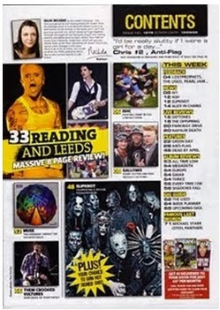
My contents page also has subscription instructions, however usually magazines have inside forms that the reader has to fill out and post, but due to my audience being on the internet most of the time due to the easy access, the subscription is all online.
I also have challenged the convention of all the content under one heading, I have split my content into two subheadings that fulfill two different aspects of my audiences life, I realized my magazine has to be organised just as well as the audiences life as the music genre influences heavily on the life of my audience.
One convention i have followed is the carry through of the house colours, i realised that this was the professional thing to do instead of completely uprooting the conventions.
My double page spread contains many typical conventions such as the crediting of the journalist and photographer, text contained in collumbs to make navigation easy, directly addressed photo, representative colours of the artist, a pull quote, page numbers and a starting capital latter to show the reader where to start.
But i have challenged the conventions in ways such as replacing the typical masthead brand that appears on the page with one of my iconic masthead figures (the flamingo) which will build up association with the brand and increase the status of the figures. I also noticed that most double page spreads are quite plainly coloured to enhance the focus onto the story itself, this is something i challenged as my background colour is a faded, pale green which represents the creep subtly, i also changed the colour of the text background to signify a change in mood or topic which creates excitement and curiosity for the reader.
The title of the double page spread is not exciting ON PURPOSE as the audience are intrigued by the front cover anchorage text the title of the story inside still doesn't give much away which forces the audience to read the spread.
No comments:
Post a Comment